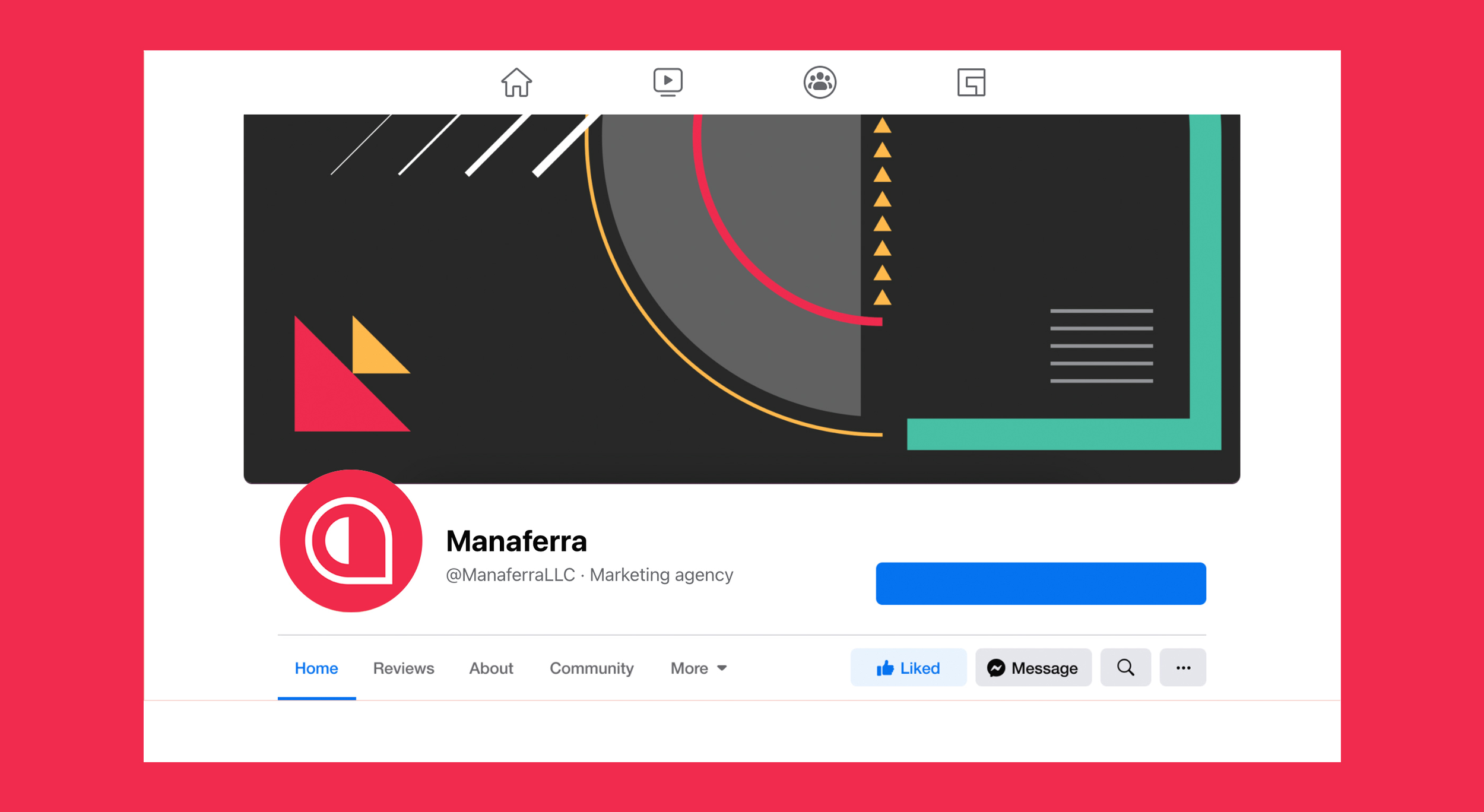
Manaferra is an SEO agency providing solutions for companies worldwide through search and content marketing. They came to Honedon looking for a fresh look and a new major visual drive and presence.
www.manaferra.com
Services:
Brand Identity - Rebrand
Brand Visuals
Web Design
Brand Identity
Sometimes some amazing brands don’t have the amazing look they deserve. This was the case with award-winning SEO company, Manaferra, who came to Honedon to fire up their brand identity. Manaferra was doing great work in its field and we know that there are very high expectations for companies providing digital solutions to have a brand look that is sophisticated and professional.
While Manaferra does have a sweet side, such as its name which translates to berry, our aim was to illustrate how the company is a first-class provider of digital solutions.
Brand Visuals
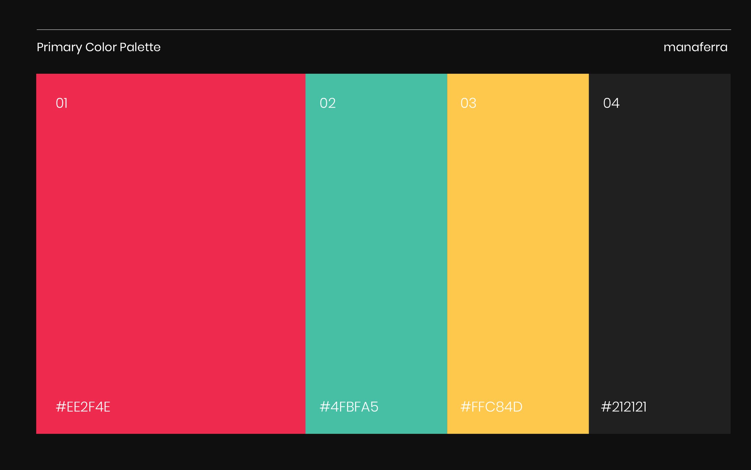
Starting with a deliciously unique berry color, we added to the color palette some natural
colors in the same tone that are kind to the eyes and refreshingly fit for a digital service company.
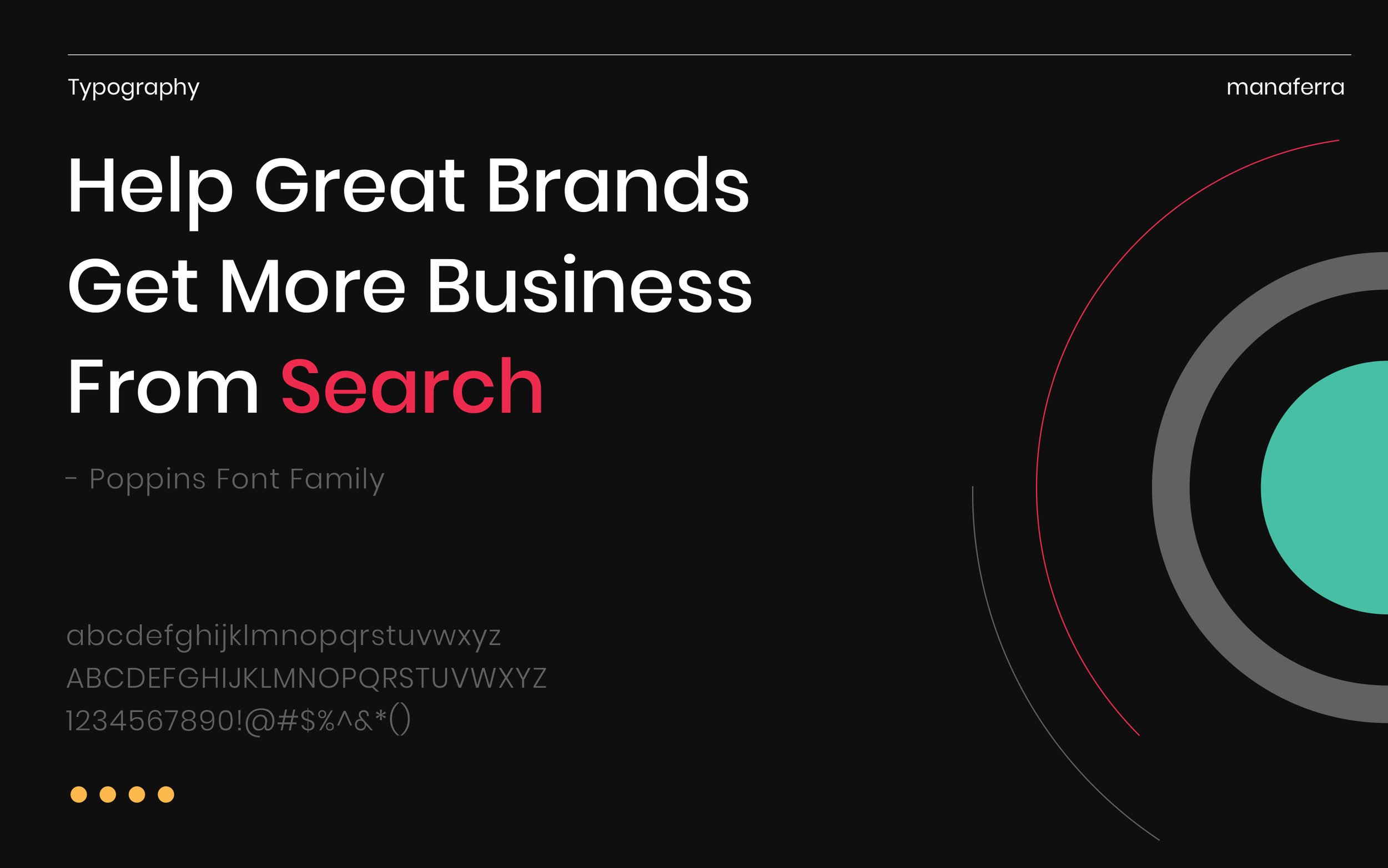
We selected Poppins and Abel as two neutral typeface options that fit well together
but contrast each other just enough to stand out.
Finally, for our favorite part.
The logo!
Our intention was to simplify a complex earlier logo and concept. We looked deeper into the berry as an integral part of the brand identity and created a symbol that represented both the berry and its particles as a symbol of SEO in the grand scheme of the digital world. Our idea was to show the playfulness of Manaferra in a professional and bold manner, with a fitting logo that leaves a beautiful and firm impression.
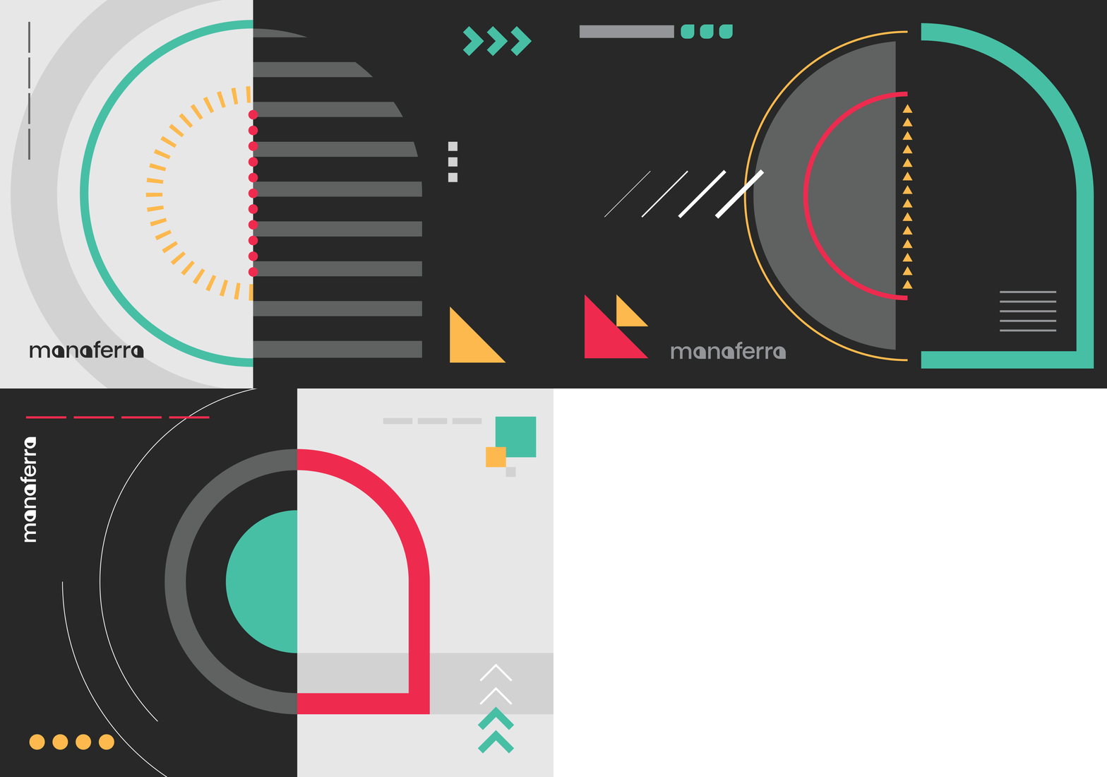
Brand pattern and visuals
Web Design
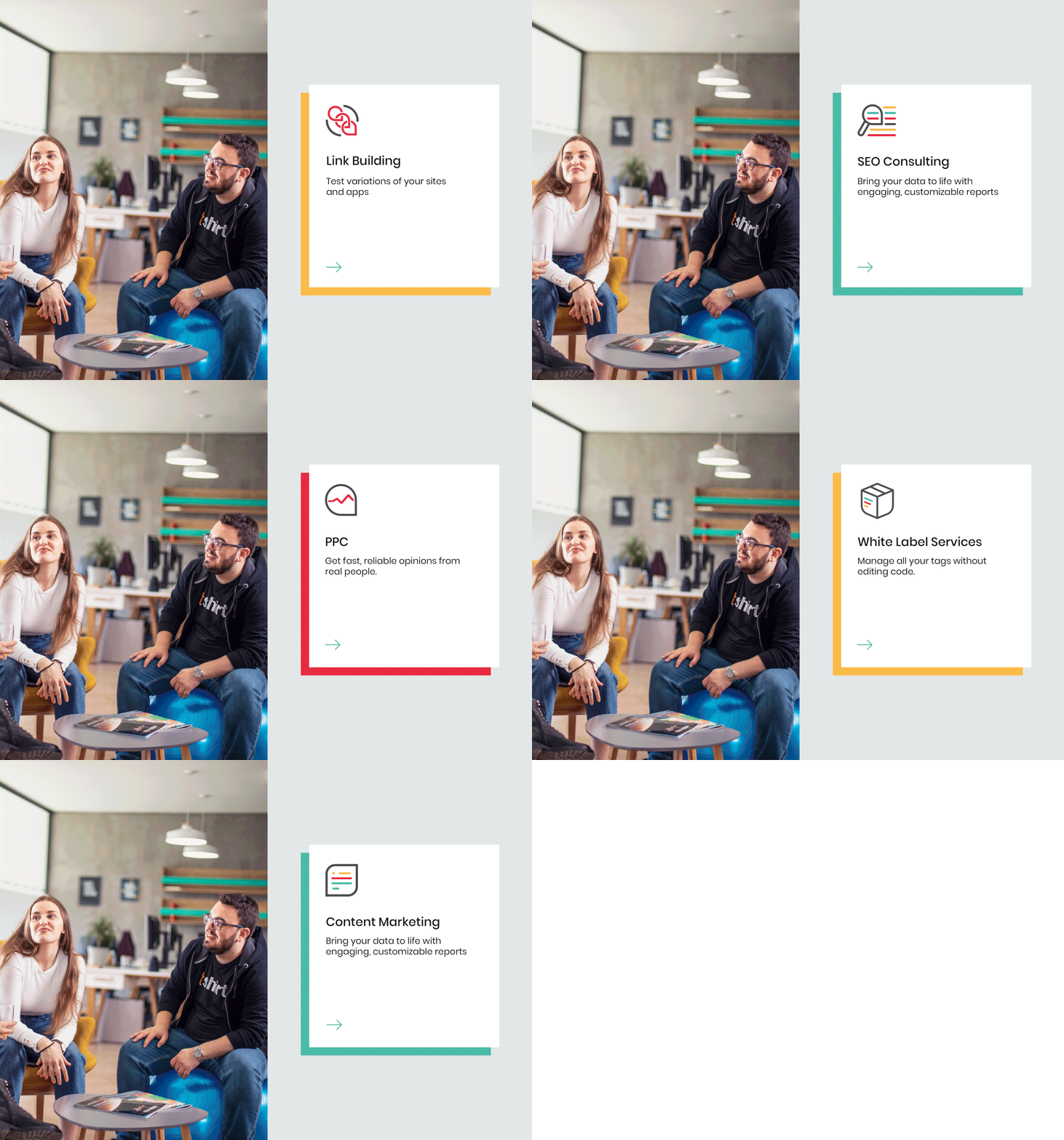
Another major update we offered Manaferra was their brand new website fully fitted to support the user experience. If anyone knows how important a website is, Manaferra does. Their focus on SEO makes them a client that appreciated every detail of our intentional website design.
We paid close attention to the way we presented their essential qualities while highlighting their accomplishments. All of this we did with the user in mind and a map for how they will best utilize the website to benefit both the user and the company.
